Telia Play Profiles
and Avatars
UI/UX Designer 2025
Redesigning the profile flows
Platforms: App (iOS/Android), web, TV (TVOS/Android/Smart TV)
Problem:
Customer service had received continuous complaints that users got lost when creating and editing profiles. They could not find their way out of edit mode, or tell where they ended up when editing was finished. Adapting the flows for accessibility made the problems bigger, which justified a completely new design.
Process (Summary):
I audited the navigation logic on every platform with screen reader, external keyboard and contrast. Together with the customer complaints, the audit set the scope. The interfaces was tested in pilot enviroment.
Make avatars fun!
I illustrated 9 new avatars based on film genres. They make it easy for users to tell one profile from another, and they make choosing a profile a little more fun, because streaming is entertainment.
3 of 9 Avatars based on movie genres
Jobs to be done by avatars:
• Make it easy for the user to distinguish one profile from another.
• Provide a more personalized experience. Can the user recognize him or her in this character/expression/energy?
• Make it fun, because streaming/Telia Play is entertainment and fun!
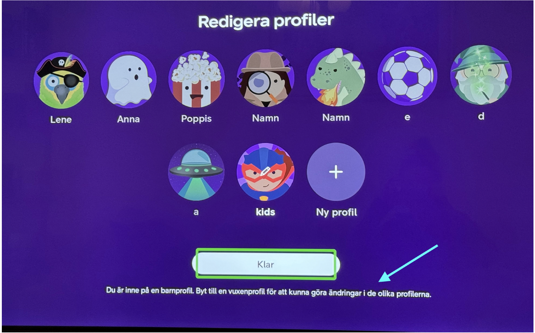
Before Redesign (TV)
Customer complaints: Feeling lost on Big screen
Customer service had received complaints from users calling in about that the edit mode didn’t seem to work. It did work, however the indications and navigation was so unclear it left several users with the feeling “something went wrong” and that even urged them to call.
In addition the avatars were similar to each other and made it harder to instantly differ between profiles. The Header “Choose profile” also contributed to a confusion.
It was possible to add up to 10 profiles which added complexity to navigate and wasn’t accessible.
After Redesign (TV)
By enabling edit per profile we solved 2 big issues.
Seeing users was enabled to both navigate to a profile to choose who’s watching, but also to navigate down to edit with a recognizable edit icon used across the app.
Users with low vision can navigate easier by listening to the accessibility labels where we guided them. Example: [Name of Profile], "avatar alt text", button + Navigate down to edit profile. (specific hint to big screen)
Placement of contextual information
A focus during the redesign was to move important information above any buttons. So it would be more clear, and so users with low vision would find it easier with screenreader. It this case it was read aloud when triggered. A new condition also occurred to implement an option for the users to choose if they wanted to show profiles at start which made it important to not add to much graphics that would feel cluttered.
Before Redesign
After Redesign
Discover all Avatars below
It was important to follow the brand guidelines of a flat illustration look but at the same time dare to be creative. I held a weekly meeting with the branding department to show progress of the illustrations each time.


WCAG: Navigation that works for everyone
When we started auditing the flows for accessibility, the problems got bigger. Patching would not hold, and that justified the cost of a full redesign.
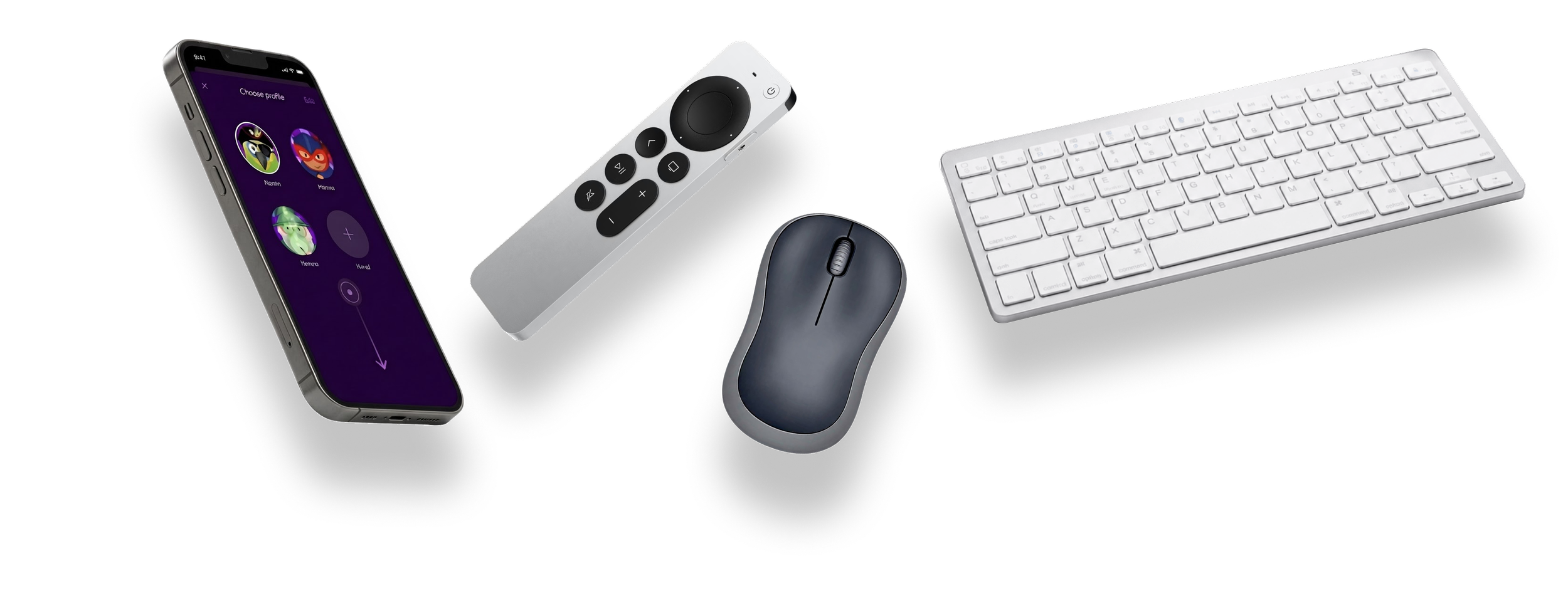
Navigating with remote vs gestures and mouse
TV: Navigating with a remove made the original design complex due to that the user can navigate in any direction and pass by other interactive elements.
Mobile app: Since there were UX cases for kids mode vs regular mode. There were also a lot of “not possible to edit/delete” etc from a kids profile that needed to be clear while navigating with screen reader. A lot of decisions regarding what to state and when to make it easy for the user to understand limitations right away was made and affected the experience.
Web: Since the web has established patterns for navigating with assistive technologies, it became the easiest platform to adapt to meet the needs of all users. Hints, labels, and context come “for free” when the components is built according to established standards and best practices.
All users needs = mades everything better
When we added the layer of making this accessible also for people with low or no vision or other impairments - the UX and UI became more clear for all users. It really proved to focus on simplicity and clarity without disabling features or options. This made it better also for seeing user due to improved hierarchy and UX copy.
Accessiblity Audit with all developers
A way of bring all developers together (TV, web; app)
Test every platform. I went through the navigation logic on mobile (iOS and Android), web and TV (tvOS, Android TV and TV box) against WCAG 2.2. I tested with screen reader (VoiceOver and TalkBack), dynamic text, external keyboard, and checked contrast.
Document the findings. Every deficiency was documented, so everyone could see what was wrong and where. Suggestions on how to solve it from UX was documented (such as navigation patterns, Hints and Labels)
Set the scope together with developers. A cross-functional team reviewed the findings and set the scope. I gathered all the different developers in the same workshop/meeting due to 1. some big screen developers also worked on small screen. They learned from their own discussions what differs between iOS/TVOS/Android which made it easier for me as a UX designer to see where we could have common ground and where it had to differ.
Testing in a pilot environment
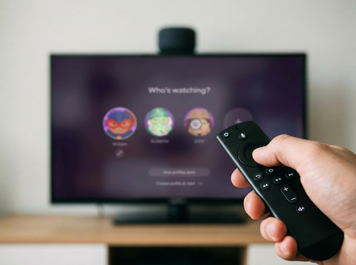
The new flows were tested in Telia Play’s pilot environment before release. More than 100 existing Telia Play users across all markets took part remotely. They were gathered in a pilot group on Facebook, where a post described what to test.
Users with disabilities also tested the flows through Axess Lab.
The pilot gave no major complaints and neither was there complaints from Axess Labs users.
After release the complaints to customer service has stopped ( I checked again one year later with no reports)