Telia Play Profiles
and Avatars
UI/UX Designer 2025
Redesigning the profile flows
I led the redesign of how users create and edit profiles on Telia Play, on TV, mobile and web. I designed the flows and the UI, wrote the accessibility labels and hints, and illustrated 9 new profile avatars.
The avatars were based of characters in Genres within streaming.
Jobs to be done by avatars:
• Make it easy for the user to distinguish one profile from another.
• Provide a more personalized experience. Can the user recognize him or her in this character/expression/energy?
• Make it fun, because streaming/Telia Play is entertainment and fun!
Before Redesign (TV)
Customer complaints: Feeling lost on Big screen
Challenge: The assignment started off with a vague request to create new avatar illustrations and to find out how to make the flows accessible.
Complaints
Customer service had received complaints since before about users calling in about that the edit mode didn’t seem to work. It did work, however the indications and navigation was so unclear it left several users with the feeling “something went wrong” and that even urged them to call.
Example to the left: A user want’s to edit 1 profile. But activates a potential edit for all.
Behöver lägga till något om webb och app med
Customer complaints: Feeling lost on Big screen
Challenge: The assignment started off with a vague request to create new avatar illustrations and to find out how to make the flows accessible.
Complaints
Customer service had received complaints since before about users calling in about that the edit mode didn’t seem to work. It did work, however the indications and navigation was so unclear it left several users with the feeling “something went wrong” and that even urged them to call.
Example to the left: A user want’s to edit 1 profile. But activates a potential edit for all.
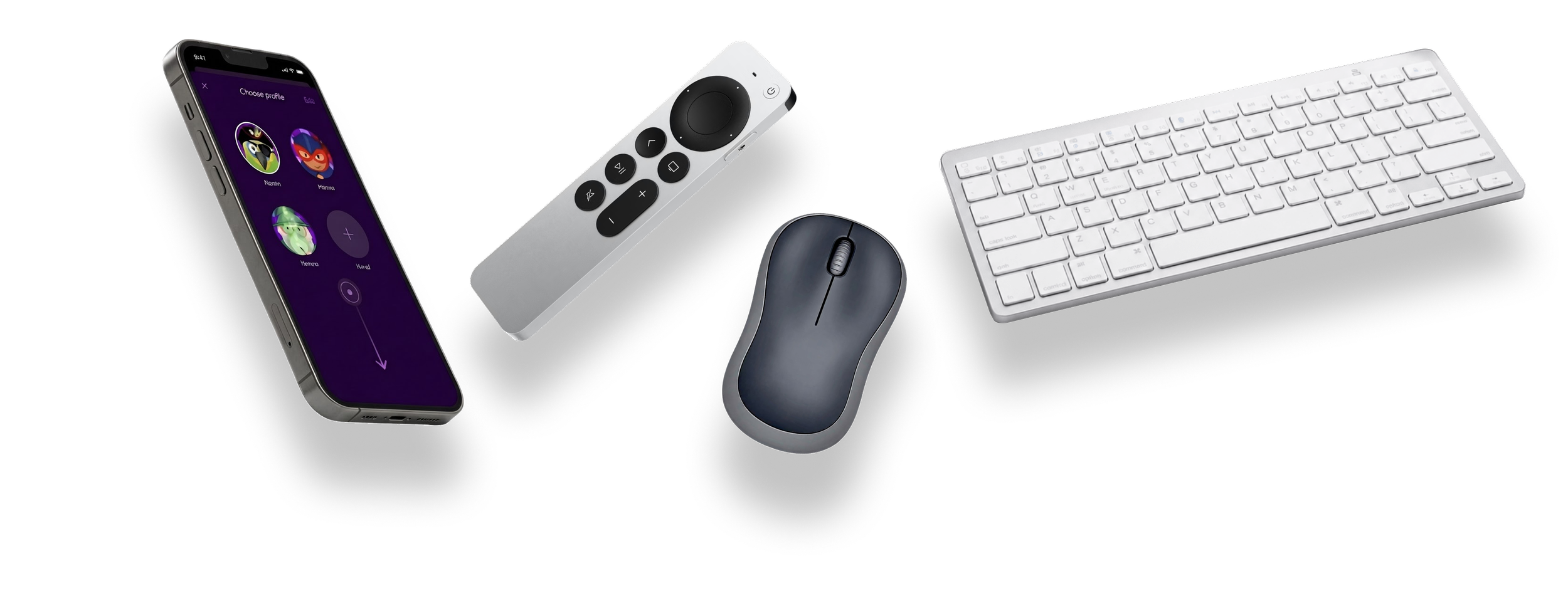
WCAG: Navigation that works for everyone
When we started auditing the flows for accessibility, the problems got bigger. Patching would not hold, and that justified the cost of a full redesign.
Navigating with remote vs gestures and mouse
Navigating with a remove makes this feel uneasy due to that he user have to step by step click their way up and down and pass by other interactive elements.
All users needs = mades everything better
When we added the layer of making this accessible also for people with low or no vision or other impairments - the UX was close to impossible since navigation with a remote can make the user navigate in all directions not know which one it the “right” way.
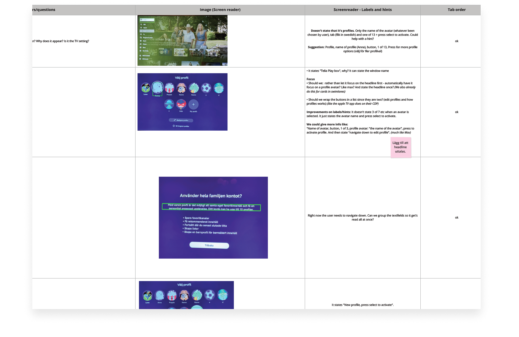
Accessiblity Audit with all developers
A way of bring all developers together (TV, web; app)
Navigating with remote vs gestures and mouse
Navigating with a remove makes this feel uneasy due to that he user have to step by step click their way up and down and pass by other interactive elements.
All users needs = mades everything better
When we added the layer of making this accessible also for people with low or no vision or other impairments - the UX was close to impossible since navigation with a remote can make the user navigate in all directions not know which one it the “right” way.


